Laura Vicente Portfolio
Product Designer

Portfolio About me

Companies I worked for

Kingston University logo Quru logo Halo Insurance logo Cheil logo Cheil logo

I am a curious and self-motivated Product Designer skilled in solving design problems with the user in mind and backed up with data-driven design decisions. I have a real passion for UX Design and my background in arts and design provided me with strong visual and creative ideas, optimal to combine with my UX analytics skills, and build usable, functional, and pleasant interfaces or products. I consider myself a UX generalist capable of researching, designing, prototyping, and testing. On the lookout for a challenging and rewarding user-centered company that offers me the opportunity to apply and develop my skills.

Articles

Designing in theory versus designing in the practice
Interfacing the future 2023. Bluring the divide
Making the impossible possible

Internal Management Platform — Overview Flow

While working at Kingfisher among other projects I was heavily involved in finding design solutions for an internal management platform in charge of monitoring the kitchen, bathroom, and storage design projects that customers are creating in B&Q.


Below, you will find a user flow diagram showcasing the various steps and actions that colleagues could undertake within the platform. It highlights the sequence of tasks and how they interconnect to streamline project management and monitoring.


Continuing to scroll down, you will come across a call-to-action (CTA) button that allows you to access a detailed PDF document. This document delves deeper into the tasks and processes involved, providing a comprehensive understanding of the functionality and potential of the platform.


By utilising this internal management platform, colleagues at B&Q were empowered to efficiently handle and track the progress of kitchen, bathroom, and storage design projects.

userflow

A Story of small incremental changes

Curtains & Blinds Configurator

Business points of view about the curtains and blinds configurator:


1

Use a 3rd party to build the configuration, with the option of having a visualiser like the John Lewis (https://www.johnlewis.com/browse/home-garden/curtains-blinds/made-to-measure-curtains/_/N-6tak)

2

Use an API with a lower-level configurator and without visualiser capabilities

3

Build our in-house curtains and blinds configurator but due to lack of the right capabilities without visualiser.

Methodology

An initial research for curtains and blinds configurator was conducted with the aim of making an informed decision about which of the 3 previously mentioned options were the best to move forward with.

12 moderated UT (user testing)sessions were conducted. 6 for desktop, 6 for mobile devices

We spent 60 minutes with customers:

-Opening interview to discuss triggers for getting curtains and/or blinds, needs, key decisions and expectations for instore experience versus online one(20 minutes)

-Observing and testing user behaviour whilst exploring and interacting with the functionality proposed in the prototypes as well as 247blinds.co.uk and johnlewis.com for choosing and selecting curtains and blinds. The aim of also testing with the user 2 competitor sites was in the case of John Lewis to discover what was the utility of the visualiser from a customer point of view (30 minutes)

-Closing interview to rationalise between what users said and what they did(10 minutes)

st

Designs

st

- All information is placed in one page;

- Price per meter & changes when the user starts changing the options;

- Sticky add to basket on a scroll;

- Binary options;

- Add to the basket only active when all required options are selected;

- By having to take the action of ticking a box, make the user aware that bespoke curtains are not refundable.

st

- Options are hidden under ‘Curtains personalisa rearchitect er’ CTA;

- Ability to order a free sample from PDP;

- Price from min value & changes when user starts adding the measurements and personalisations;

- ‘Add to basket’ CTA becomes active once all required binary options are selected;

- There is ability to review chosen options.

Desktop - Test insights and key learnings

Positives

5/6 desktop participants chose second option ( the option with the CTA to "curtains personaliser") like more comfortable to use

1st option: 1/6 mentioned that it’s straight forward and clear way to select everything they needed;

2nd option: The CTA ’Curtains personalizer’ gave the participants a clear distinction in an offering for something that will be tailored to their needs;

2nd option: Having the options separate from the rest of the content by opening the overlay screen made them better focused on their choice;

2nd option: The summary list with the selected options was mentioned as an useful feature by 4/5 participants;

2nd option: 6/6 participants assessed the feature with ordering a free sample like very useful;

2nd option: The gradual price change was noticed more often (it can be because of knowing the scenario from the first option)

Options 1 & 2: All participants mentioned the importance of images, simple and clear flow to follow as well as good visibility of the reviews (reviews were important trigger for the purchase).

Things to improve

2nd option: It wasn’t obvious for some participants that they could close the overlay to be able to see the list of selected options;

2nd option: 5/6 participants mentioned that it will useful to also see the price next to each customisable option;

2nd option: It wasn’t obvious that it was possible to click on each option in the summary list to be able to change it;

2nd option: 3/6 participants were confused by seeing the ‘Curtains personalizer’ CTA below the summary list of options. They thought they needed to do something more to be able to continue instead understand if was in case they would want to edit the list;

Option 1: It wasn’t obvious for some participants that the price in the sticky menu was dinamically changing (might be due to prototype constrictions);

Options 1 & 2: Even almost all the participants noticed the “learn more” link. They still mentioned their expectations were to see not only the text but also some pictures/videos within to learn more about each option;

Mobile

Mobile- Designs and Test insights and key learnings

- For the mobile version, we tested two options with the CTA to customise curtains. Option 1 opens an overlay when clicked while option 2 works as an accordion that expands or contracts upon the user's click.

Testing results

-5/6 mobile participants chose second option like more comfortable to use (the option that represents all content in one page);

-The mentioned suggestion of adding price per item was introduced in the mobile versions and 6/6 participants during the conversation noticed the additional price for every item;

-Participants commented that they liked to see the CTA saying 'Personalised curtains', as it made them more aware of the differences between buying a default curtain or a customised one;

-ame as for desktop: all participants needed additional information about every parameter with visuals (images and/or videos),guidance about correct measurements;

-Information about warranty and returns policy needed to be more visible.

Final insights

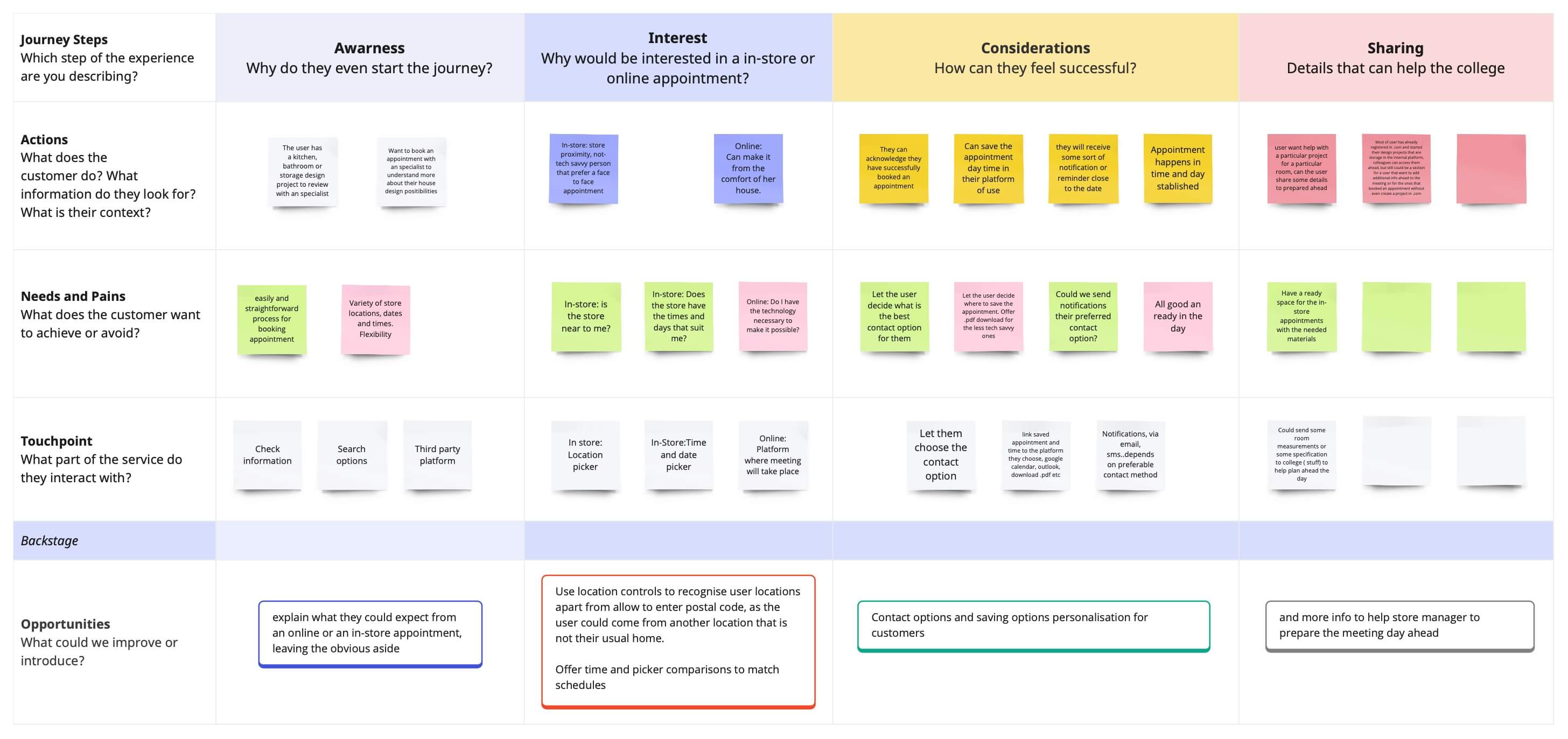
How do customers choose?

Usually, customers have an idea of what they want to buy (in terms of colour, measurements, type etc.), they try to compare the image that they have in their minds with the items online or in store

Would anything make the process easier for customers?

-All participant’s ideas are around some guidance or facilities that could make them sure that the curtains and/or blinds will fit them;

-To have a demo room with options to choose from room types (e.g. nursery, kitchen, bathroom, bedroom etc.) different tips on how to be able to install curtains or blinds, and to see how they may look and feel;

- To be able to see and touch the product unrolled;

- To have specific assistance from the person who has knowledge about process of installation, about fabrics, colours and correct measurements.

Do customers need a visualiser or would it be a simple configuration piece, such as a calculator?

Assumption from research is that customers do like visualiser like something that is nice to have. However, most participants described what they observed in other visualiser was like not real and admitted that to have many images and/or videos of the product could help even better than visualiser.

-The need to visualise is based on the need to understand how the product would look like and on the fear that it can be totally different in real life (from colour, texture, fabric or other options perspective);

- The research showed that users can rely on images/photos proposed by the website if there are many of them and of good quality, with different scales and angles. The option to order a free sample mitigates the pain about fabric quality.

The proposal

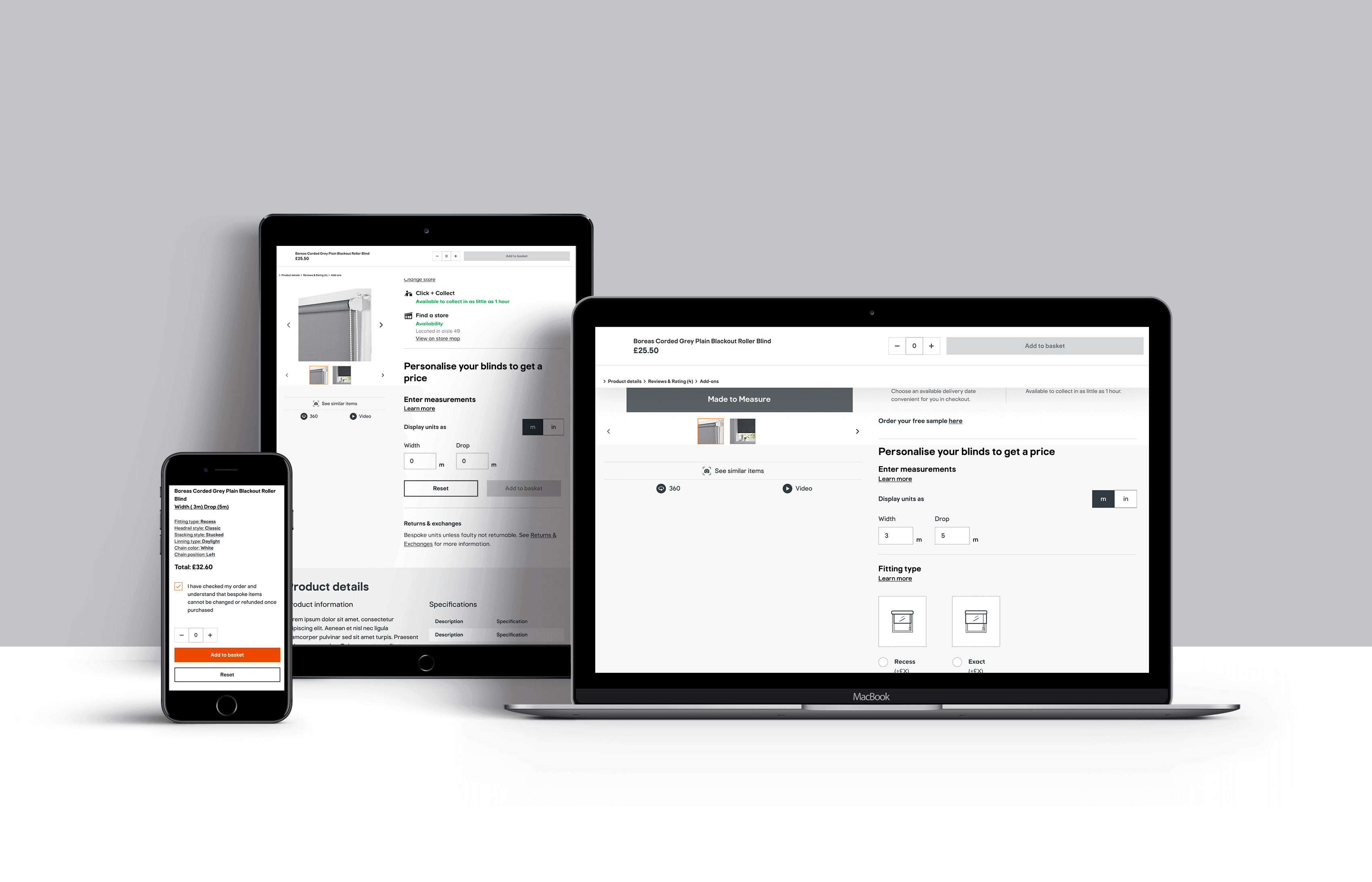
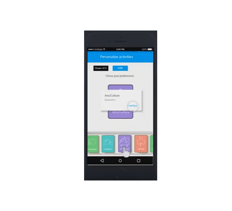
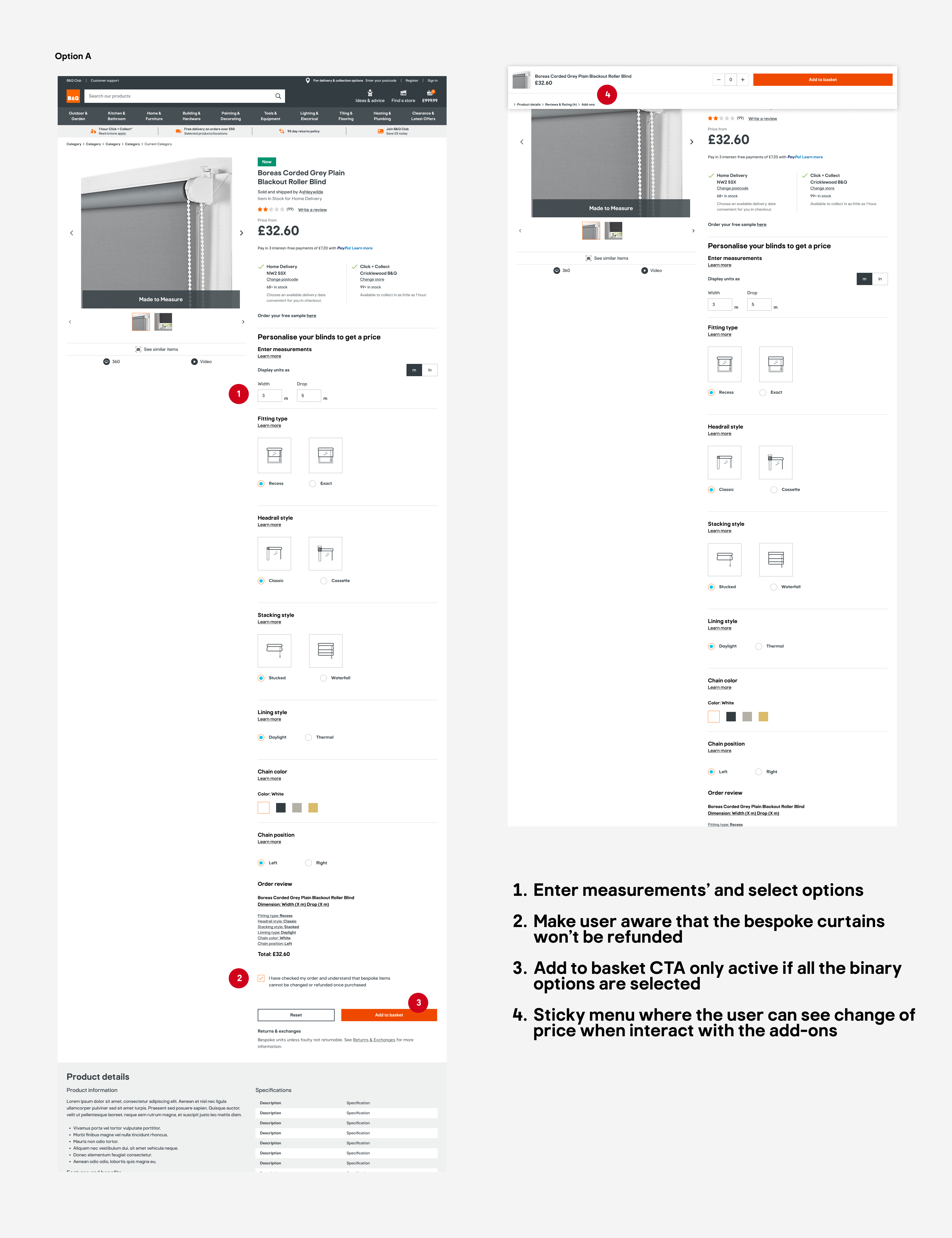
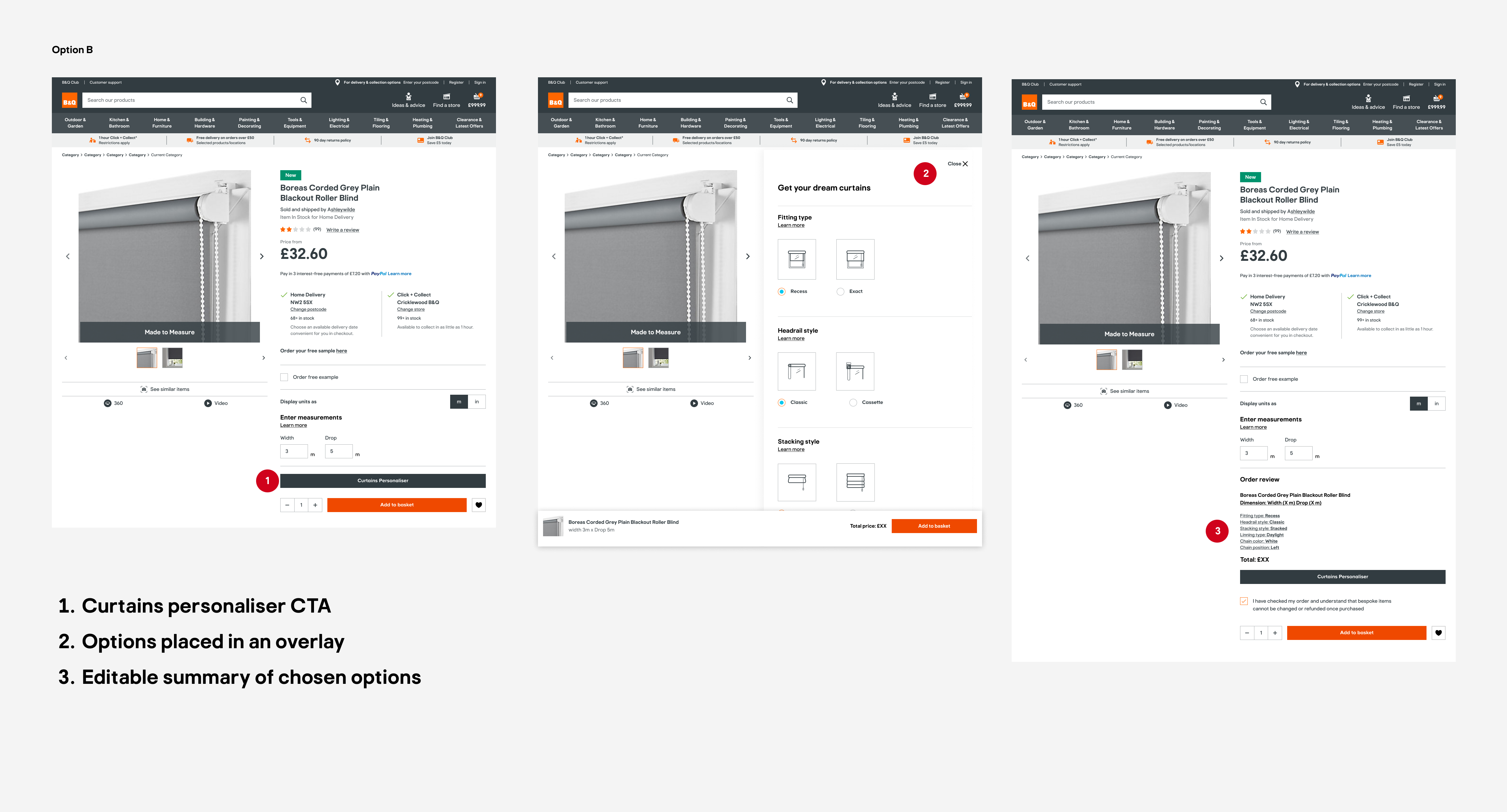
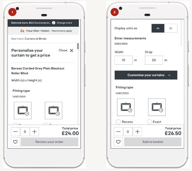
After considering all the factors mentioned above, a final design was developed to enhance the customer's personalisation process. The design incorporated a progressive disclosure technique, allowing customers to navigate through the process seamlessly and without feeling overwhelmed. Instead of simply adding a call-to-action (CTA) to proceed to the personalization process, the page was divided with a clear title indicating the user's location within the personalization journey. This approach ensured that all users were on the same page, while information was revealed gradually in manageable chunks.


Looking for further enhancement,a pending query about upselling with an insurance option was raised.The business was asked to offer additional coverage to provide peace of mind in case of measurement mistakes. It is important to note that bespoke items, which are tailored specifically for the customer, are typically non-refundable. To make users more aware of this policy, they are required to actively tick a box before committing to purchase, ensuring they acknowledge and understand the non-refundable nature of the product.


Improvements were also requested for the imagery and video content, with a focus on detailed zooming capabilities. However, if these enhancements were not feasible, customers still had the option to request a free sample to be delivered to their home, allowing them to inspect the product before making a final decision.


At the end of the personaliSation process, users were provided with a summary list that included all the personalized aspects of the item. By clicking on each item in the list, users could easily navigate back to the corresponding add-on or detail in case they needed to make any last-minute changes.


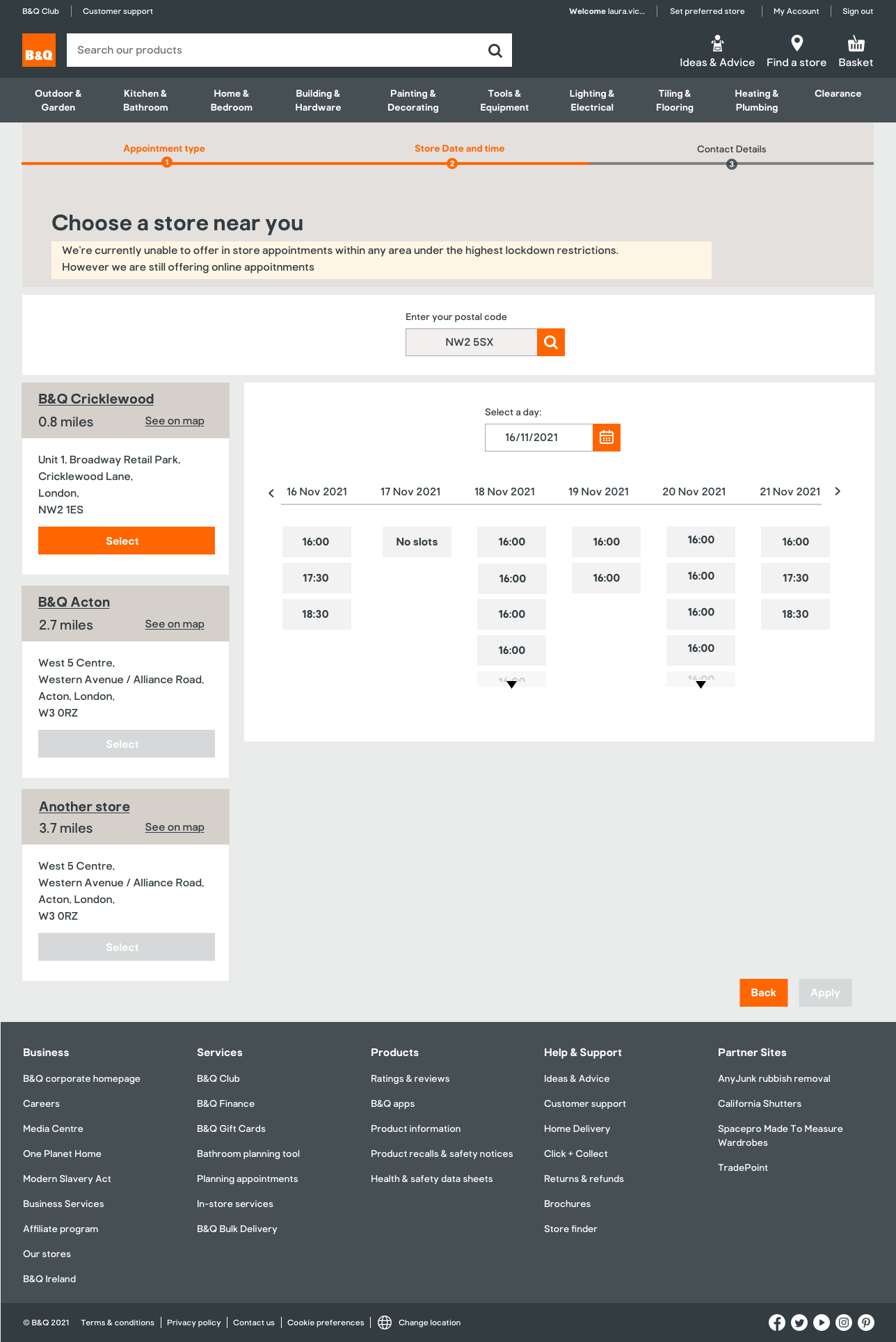
There were also discussions about the delivery process. Initially, the business considered offering only a click-and-collect option. However, it was deemed desirable to provide home delivery as well, especially considering the potentially heavy nature of the items. While click-and-collect could be convenient for customers with cars, it may not be as viable for those relying on public transportation. Offering choices to customers is always ideal, ensuring that they can select the delivery method that best suits their needs.

st

Emoti-C-on — Kickoff

AutisticSociety
1

The National Autistic Society estimates that there are around 700,000 people on the autistic spectrum in UK more than 1 in 100 people. Families included, autism is a part of daily life for 2.8 million people. Autistic children tend to have communication problems and challenges in expressing their emotions. Teachers in various autistic schools admit finding it challenging to get and maintain the attention of their students. These teachers also have limited teaching tools (e.g. PECS and TEACCH) most of which are paper-based. There is, therefore, a gap in the market for technology-enhanced teaching tools like the Emoti-C-on application.

Emoti-C-on Overview

2

The project would be launched as an e-learning app/ platform for teachers' use to enhance social skills and empathy in autistic children. Focused mainly on emotions, it is a highly customizable application which provides a personalized learning plan, empowering children to take an active part in their own learning. It involves pairing illustrated emotions using a facial expression recognition system with the appropriate scenarios. The app also enhances positive social reinforcement, as it provides some gaming experience in which the children have to coordinate and communicate their actions with a partner.

Research activity

WheelCompet
1

The application is targeted at teachers of autistic pre-school children - given the importance of early childhood development (emotionally and otherwise). In future the application could be extended to cater for later development years.

2

Our market research revealed that, although there is a considerable number of applications targeted at autistic children, one is yet to find any application focused on helping teachers / autistic children achieve their teaching/learning objectives.

3

The infographic on the University of Edinburgh site (http://www.dart.ed.ac.uk/wp-content/uploads/2013/07/app-wheel-April15.pdf) gives an overview of popular apps for autistic users and shows highlights the lack of tools for teachers of autistic children.

Design thinking process methodology

DesignThinkingPict
1

Empathize: This will entail researching processes and learning more about our target audience through further interviews and observations.

2

Define: This will involve synthesizing and analysing gathered data for this purpose.

3

Ideate, Prototype, Test: This will involve the detailed design of the app

4

Build: Incorporating any further feedback from these tests, the prototype and requirements specifications.

Some paper wireframes

PaperWireframe PaperWireframe
1

Coordinate, communicate, choose

2

Clear instructions

3

Help user customize things

4

Storytelling

Prorotype — Simple as 1, 2, 3

1

The aim of this project is to have an application that allows them to enjoy themselves at the same time as they are learning emotions and social skills.The target audience are four year-old children and upwards

2

Provide a high-customization for parents in order to be as adaptable as possible to the different autistic spectrum of children. It should be mistake-free to reduce frustration as autistic children usually are really perfectionists and have incredibly high standards for themselves so they would feel really uncomfortable if they failed.

3

It should be based on clear instructions and help them in the coordination and communication with other children as well as help them make decisions and encourage them to enjoy social activities apart from the core objective of teaching them to distinguish between different emotions.

KU Extra — Kickoff

KUpict
1

Studies show that students who engage with co-curricular/ extracurricular activities tend to perform better academically and develop into well-rounded graduates.

2

KU is committed to equipping our students to be confident, creative and resilient people who flourish in their studies, careers and personal lives

3

This involves a strong focus on providing relevant and personalised support and service to students (within and outside the classroom).

4

This makes them more attractive to prospective employers

KU Extra — Overview

overview
1

In the context of the CfGE project, students are the main users.

2

The aim is to create a platform/ service they connect with and will enjoy using.

3

The purpose of the focus group sessions was to understand students:

  1. Motivations for HE study (at KU)
  2. Current awareness of and engagement (or lack thereof) with existing co-curricular/ extracurricular programmes.
  3. use of technology.

KU Extra — Focus groups discussion: Aspirations and motivations

When asked about what they want to get out of their studies and the career opportunities they believe their course offered:

Most(over 90%) of the participants said they want good employment on graduation.

Some students (mainly L4) were unsure of their career prospects and wanted more guidance (from their faculties) on this.

Awareness and Engagement

  1. 50% of the participants were aware of at least one KU co-curricular initiative listed on the slide they were shown.
  2. On average, students indicated a patchy engagement with KU co-curricular initiatives.


Personas. Student(user)Story

overview
1

Profile

Name: Chan
Course/ level of study: Computer Science / L5
Interests: Baking (loves watching the Great British Bake-Off!), Music and Badminton
Other details: First in family to attend HE, commuter and works part-time at a local music store

2

Challenge

Would love to be more involved in KU extracurricular activities but has: little or no awareness of events aligned with his interests happening on campus. time constraints due to commute and part-time job. few friends in KU and struggles to feel a sense of belonging.

3

Solution

Chan obtains the CfGE app (which already has access to his basic student information) and updates this with preferences. Now has a joined-up view of KU extracurricular activities Gets alerts on his mobile when relevant activities are coming up. App also recommends other potentially beneficial events.

4

Outcome

Chan attends recommended to meet fellow students in other faculties with similar interests. Joins the classical music society and the KU badmington team Makes new friends as a result . Feels greater sense of belonging to KU.

Personalised Icon Design

Example some extracocurricular activities

jobs
1

Jobs and paid opportunities

jobs
2

Sustainability

jobs
3

Surprise me

jobs
4

Languages

jobs
5

Volunteer

jobs
6

Arts and culture

jobs
7

Disabily support

jobs
8

Academic success

Service blueprint

serviceblueprint

Prototype

1

AIM
In line with KU Inclusive Curriculum Framework, the CfGE aims to expand students experience beyond their courses by providing a coherent framework of personalised, easily-accessible and relevant co-curricular activities.
Use of gamification.Offering two version classic and game

2

Process
Previous paper wireframe made and tested with students. Still on process to keep testing and improving the desing

3

THE WAY FORWARD
Implement main platform over next few months in 2017. Pilot with cross-section of current students before wider launch in 2018. Mid-/ long-term: -Extend service to alumni and prospective students. -Establish employer partnerships.

Emoti-C-on — Kickoff

AutisticSociety
1

The National Autistic Society estimates that there are around 700,000 people on the autistic spectrum in UK more than 1 in 100 people. Families included, autism is a part of daily life for 2.8 million people. Autistic children tend to have communication problems and challenges in expressing their emotions. Teachers in various autistic schools admit finding it challenging to get and maintain the attention of their students. These teachers also have limited teaching tools (e.g. PECS and TEACCH) most of which are paper-based. There is, therefore, a gap in the market for technology-enhanced teaching tools like the Emoti-C-on application.

Emoti-C-on Overview

2

The project would be launched as an e-learning app/ platform for teachers' use to enhance social skills and empathy in autistic children. Focused mainly on emotions, it is a highly customizable application which provides a personalized learning plan, empowering children to take an active part in their own learning. It involves pairing illustrated emotions using a facial expression recognition system with the appropriate scenarios. The app also enhances positive social reinforcement, as it provides some gaming experience in which the children have to coordinate and communicate their actions with a partner.

Research activity

WheelCompet
1

The application is targeted at teachers of autistic pre-school children - given the importance of early childhood development (emotionally and otherwise). In future the application could be extended to cater for later development years.

2

Our market research revealed that, although there is a considerable number of applications targeted at autistic children, one is yet to find any application focused on helping teachers / autistic children achieve their teaching/learning objectives.

3

The infographic on the University of Edinburgh site (http://www.dart.ed.ac.uk/wp-content/uploads/2013/07/app-wheel-April15.pdf) gives an overview of popular apps for autistic users and shows highlights the lack of tools for teachers of autistic children.

Design thinking process methodology

DesignThinkingPict
1

Empathize: This will entail researching processes and learning more about our target audience through further interviews and observations.

2

Define: This will involve synthesizing and analysing gathered data for this purpose.

3

Ideate, Prototype, Test: This will involve the detailed design of the app

4

Build: Incorporating any further feedback from these tests, the prototype and requirements specifications.

Some paper wireframes

PaperWireframe PaperWireframe
1

Coordinate, communicate, choose

2

Clear instructions

3

Help user customize things

4

Storytelling

Prorotype — Simple as 1, 2, 3

memotion
1

The aim of this project is to have an application that allows them to enjoy themselves at the same time as they are learning emotions and social skills.The target audience are four year-old children and upwards

2

Provide a high-customization for parents in order to be as adaptable as possible to the different autistic spectrum of children. It should be mistake-free to reduce frustration as autistic children usually are really perfectionists and have incredibly high standards for themselves so they would feel really uncomfortable if they failed.

3

It should be based on clear instructions and help them in the coordination and communication with other children as well as help them make decisions and encourage them to enjoy social activities apart from the core objective of teaching them to distinguish between different emotions.

Video-subtitles explanation prototype

1

Empathize: This will entail researching processes and learning more about our target audience through further interviews and observations.

2

Define: This will involve synthesizing and analysing gathered data for this purpose.

3

Ideate, Prototype, Test: This will involve the detailed design of the app

4

Build: Incorporating any further feedback from these tests, the prototype and requirements specifications.

Redesign — insurance App

illustration

Work carried out while working at Halo Insurance,a significant project involved transitioning from an outdated and cumbersome insurance application to a more modern and user-friendly platform. The primary objective was to create a simplified and intuitive user experience.


To achieve this, an emphasis was placed on employing a simple and clear design that would effectively guide users towards the desired actions. The process of obtaining a policy quote was transformed into a conversational experience, where users navigated through a series of question-answer interactions. This approach enhanced the overall user experience by creating a more personalised and engaging journey.

In order to streamline the user's progress, dynamic content was implemented in the form of displaying the next question in a greyed-out state until the previous one was answered. This approach prevented overwhelming the user with an excessive amount of information all at once, allowing them to focus on one question at a time.

Furthermore, the screen layouts were carefully optimised to reduce clutter and distractions. By decluttering the screens, users were able to concentrate on the specific task at hand and maintain a clear understanding of their progress throughout the process. Additionally, providing comprehensive information about each choice allowed users to make informed decisions, with the flexibility to review and adjust their choices by scrolling up and down the page.


Overall, the efforts made at Halo Insurance resulted in the development of a more modern and user-friendly insurance application. The incorporation of conversational interactions, dynamic content, and decluttered screens significantly enhanced the user experience, ensuring a seamless and intuitive journey for obtaining policy quotes.

Overview

userflow

Snaps — Explanation

userflow

-Help the user to adequately document the condition of the vehicle

-Record the status of the hire vehicle and document the journey

-Easy to share the pictures

userflow

Prototype

Go on a Flavourful Journey — Discover a new juice brand

logo
1

Creating a new juice brand evoking the natural, exotic and sensual

2

The leaf-like a shapes of the letters emphasise the idea, and the green colour suggests organicity

packaging packaging
1

Playing with shapes and colours typical of different territories.l

2

Mixing illustrations and photos to give the image plasticity.

BREAKING BORDERS — Begin your journey without the fear of getting lost

branding
1

GPS - like app Symbol recreates a road landscape

2

Colours Blue (reliable and trustworthy, easily readable by computers) Green ( it reminds us of nature, positive, encouraging)

3

Only lower - case characters with minimalistic lines giving them a mechanical feeling

app on iPhone app on iPhone app on iPhone
4

Creating a corporate campaign that conveys confidence in an innovative product, inviting us to come closer.

5

Playing with colours and symbols to create a modern and long-lasting graphic.

6

Corporate use of colour countertypes.

Appointment Booking system - Initial research

adoption map

Current experience pain points

Pain Points

Pain points

-Too many steps for the customer to reach their goal and not all seem needed. There is a progression bar. It would create less uncertainty if the customer could see the number of steps required to fulfill the process, the bar is inconclusive while the number of steps creates a clear path of progression.

-Bad Prioritisation of the booking appointment steps process.A customer who chooses an in-store appointment will be most interested in knowing what their location options are. Only the in-store colleague will be more relevant in knowing what type of project the customer wants to discuss. We should prioritise customer needs, change the order of questions, and ask for the location first instead of the type of project since this tool is primarily for the customer.


-There isn't any explanation of what the customer could expect from an online or in-store appointment.


-It does not ask for a preferred contact form, this makes the users have to fill in unnecessary input fields.


-The system doesn't allow the customers to compare available dates and times.


-Do colleagues (members of the staff) have enough information about customer requirements to have a successful appointment? So far, customers have only asked about the type of project, but what about, for example, room measurements?.


-Book an appointment is only for customers who have an account (customers that are registered) could we then autofill some personal info such as name or email? And allow customers to change it if needed. Prepopulate personal data.


-Important! Keep in mind how the internal colleague interface works(colleague JRNI interface)"a desk" is part of the resource assigned to the appointment. This is assigned to the person in "studio"

Options
1

Landing page (As shown in the screenshot, the first on the left) Some users might miss the content under the fold by immediately interacting with the CTAs (call to actions, buttons).

2

Would be nice to have some sort of secondary menu with tabs anchoring to its sections (see the mock-up screen on the right). This allows the user to easily skim content and quickly find any section of interest if needed before going into the book and appointment journey. Worth assessing if we need/want this long landing page, though.

3

As it was discovered in the pain points would be nice to start asking the customer for the postal code as it was previously explained, it is a question that would open the path of possibilities for the customer.

Could we add geolocation API to determine location? So the user can type a postal code or choose the location detected from the API?.

3

Once the user enters the postal code, and the system knows proximities and possibilities, it is when it brings up the two possible ways of booking an appointment. For example, it could happen that there might not exist an in-store appointment for a certain location, and having the location first could mitigate and give the customer options).

Use existing landing page explanation videos. If we make a layout like the one shown in the mock-up, we could have the video follow for some summed-up key points of what they could expect for the appointment. It brings the content into context, which allows the customer to easily understand what they expect from the appointments.

Options
1

Currently, the user can't easily compare between dates and times available. Offering the user a date picker calendar where the user can decide whether the customer wants to type into the input field the date or open the calendar through the icon, and choose the desired date. When open, the calendar would grey out the days when there aren't slots available.

Slots won't become visible to the user until the user picks up a date because the system can't know the available slots until it knows the date the user picked up.

2

Once the user has entered a date into the date picker, the time slots appear on the screen for the user to pick up the desired one. The enhancement to the current date and time slot picker is that in this proposed way, the user could compare 6 days of slots available from the entry day. So the user can make the time match with its availability, without having to start the process from scratch.

3

The Apply CTA would not become active until the time slot is activated (so both date and time are inputted).

ConfirmationStep
1

Let the user have the opportunity to decide what is the preferred contact method and based on that only ask for information related to that.

Add numbered points to the progress bar, making it as a stepper with titles for each step would help anticipation and expected discoverability.

2

As a cosmetic improvement, make the split between the input field boxes section and the booking summary section 60/40 instead of 80/20, so the booking summary does not look too squeezed to the right, and it is easy to read.

Could we allow the user to edit from the summary? Could we allow pre-population of data for users that are already registered? For example, make the appointment type clickable (hyperlink) and when the user clicks it to edit it takes the user back to the appointment type step where the user can change it. Same if clicking on date and time takes the user back to the slots' picker stepper.

Double check, do only users who created an account have access to the booking appointment system or both? If not, do we want to offer to create an account when they add their data?

3

Simplified confirmation screen.

Further considerations

Options

-After asking some questions to the product owner. The type of project had to be included in the early stages, as it is what would help to decide what member of the staff would be leading the design meeting with the customer. So even if it is not as useful for the user, it is a business requirement that had to be met.

-As the type of project had to be the first question due to business requirements, to simplify the user steps, I looked into the option to merge locations and dates. So the user could at first glance not only see the available slots in a 6-day interval, if not also compare them with the stores available (for the users choosing in-store appointments).


-The next question that came to mind was how to avoid 2 customers booking an appointment at the same time. To avoid so, it was needed to set a timer for the user to be involved in the booking appointment process and show the slot greyed out for any other customers. Would be also good to offer the customer reminders of session time left (for example, 5 min. left for the session to expire). With this approach, we could avoid a customer starting the appointment booking process and leaving it halved by hours because moved from his desk and so stopped other customers from getting his preferred slot.

Mobile version

Options

The screen at the left shows how all this could be displayed on a small mobile screen. It will show the locations to choose from with the slots in a horizontally scrollable manner. The customer would have quick options for morning or afternoon slots.

The middle content will be scrollable, while the main call to action to go back or apply results will remain at the bottom of the screen to make easy access for the end user.

Halo site — Kickoff

HaloInsurance old site
1

Site was outdated and felt old.

2

The framework was unstable.

3

The content quality was not matching the company expectations. There was a need on focusing the site on partnerships which is the key driver of the company growth.

Research activity

Research
4

Competitive research into other insurance sites,corporate sites,intellectual(brand patents,copyright,data),life insurance,car insurance

Redesign user flow

current user flow
draw_flow
New_sitemap
1

Previosly,submenus within the main menu with not a clear herarchy,lots of pages no needed and duplicated content

2

Currently, a redesign and relayout of the web platform empowering the partnerships and products.

Wireframes

wireframe gif
wireframe desktop
Wireframe mobile
1

Improvements in the timeline layout, before where a grid with squares and now we tried to give a more fresh look and feel with a scrolled layout where it is easiest see the cronology and achievements

2

A new functionality added on the products page allows the user to search products by country. This enhances the usability since most of the products are split into countries. Type the country or choose to with the drop-down menu and press the button to see the product related to the selected country.

user Interface

Personalised set of icons
Live site